Starbucks 2018 Fall Campaign | Typography, In-Store Design, Print Design
A love letter to Milan.
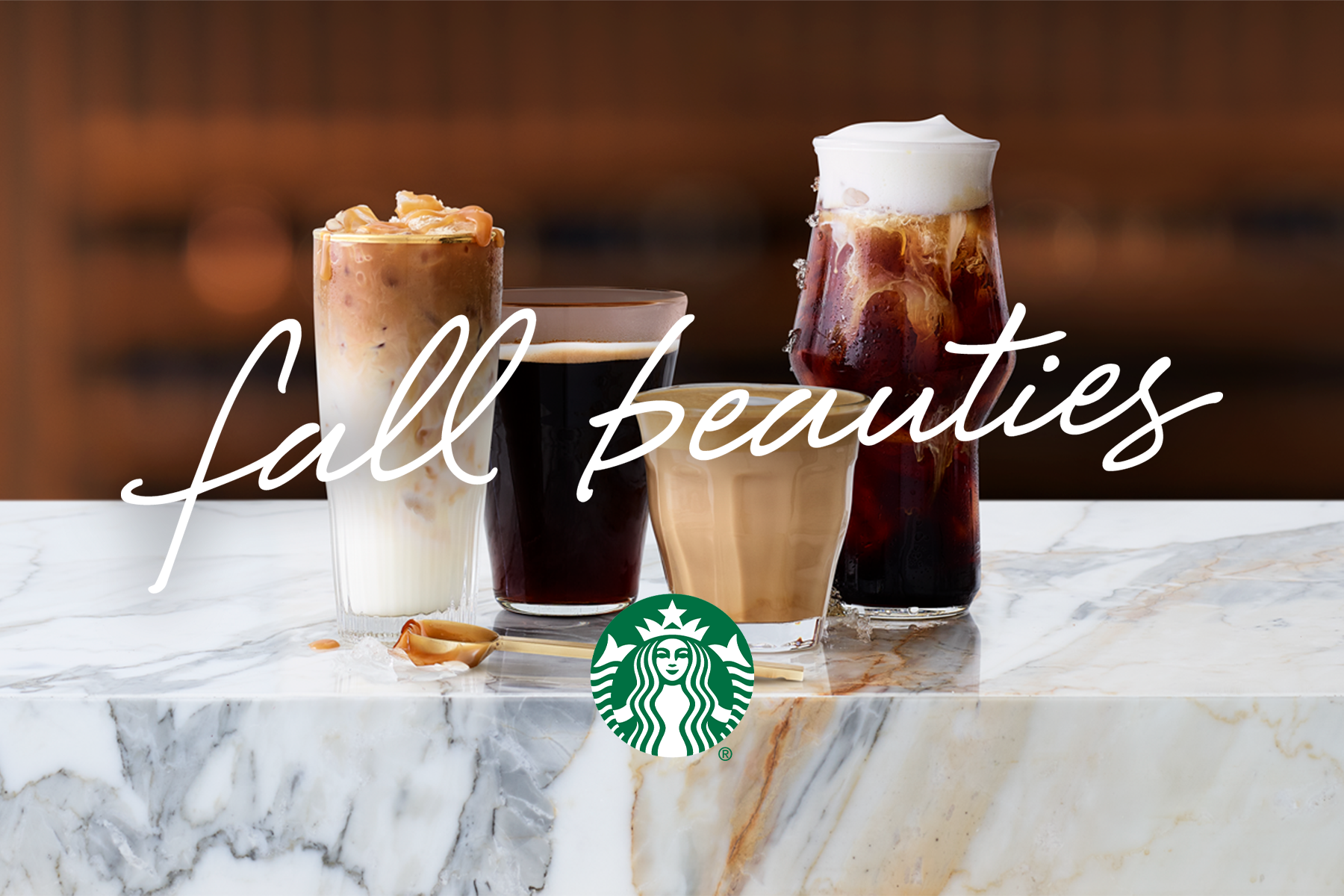
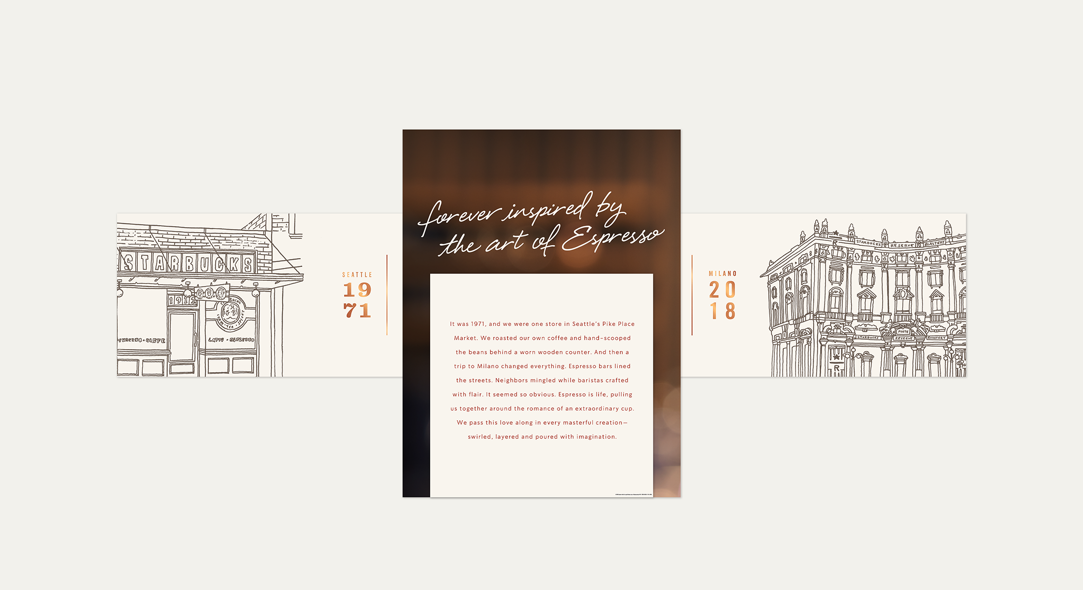
The goal of the 2018 Starbucks fall campaign was to highlight a pivotal origin story; a trip to Milan in 1971 turned what was formerly a single store location selling roasted coffee and hand-scooped beans into the espresso-forward powerhouse that Starbucks is known to be today. 2018 was also the year that Starbucks opened it’s first Italian location— the Reserve Roastery in Milan. This campaign was heavily inspired by Italian art and culture as our goal was to represent this full circle moment, a return to the city that started it all. A love letter to Milan, if you will.
Designing the in-store experience
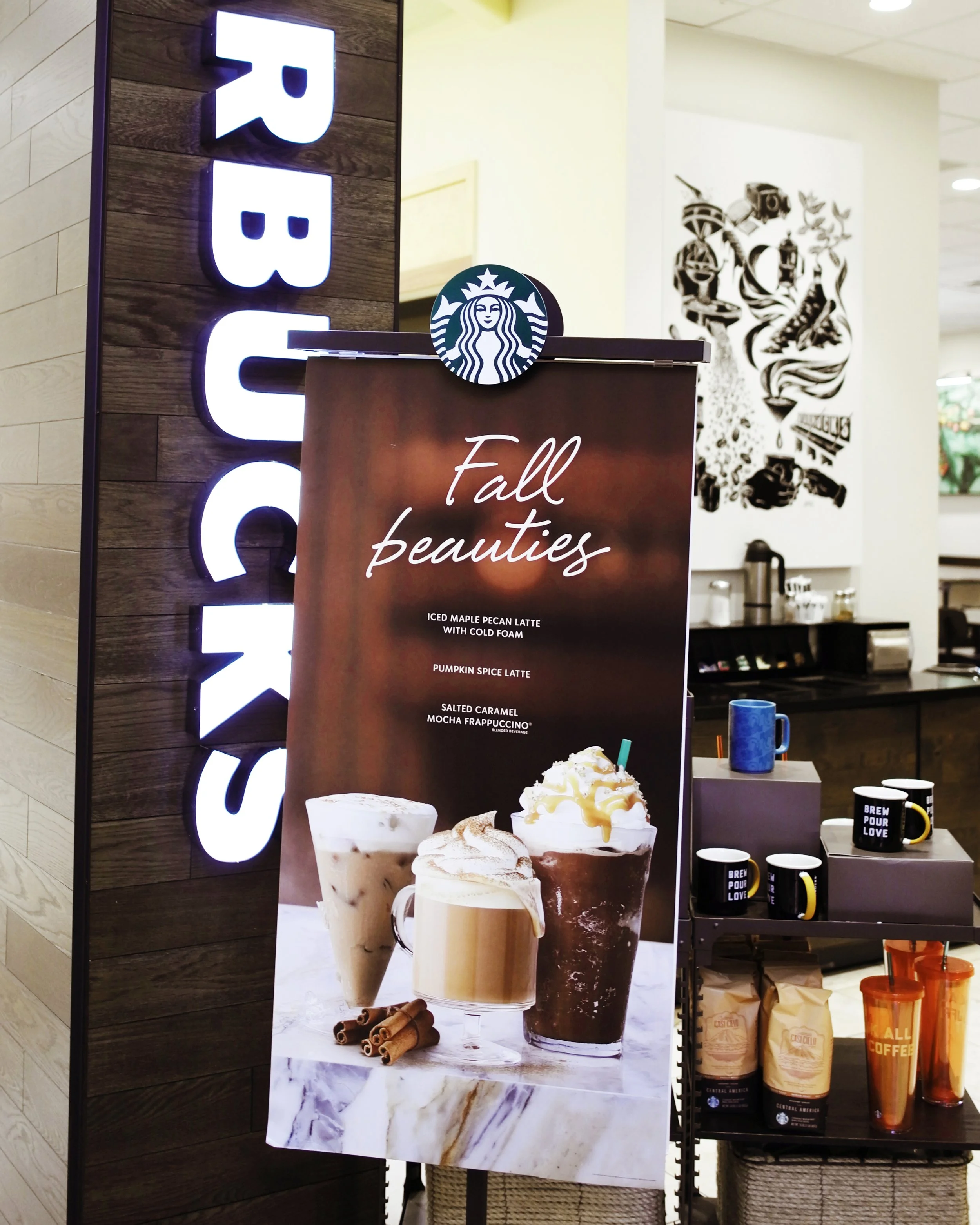
A huge component of my role within the campaign team was designing the printed material that would outfit the physical store locations. We worked closely with visual merchandising and the printing team to optimize our brand story and ensure it came across as we intended in execution. A large challenge of this process was that every Starbucks store location is laid out differently; in addition, printed materials are handed off to local store teams to assemble and display on the design team’s behalf. This means that our design goals needed to be clear and easy to execute, while still conveying the visual brand story as we intended. In addition to the physical space itself, an exciting addition to this campaign was the opportunity to design a special edition cup that would be offered exclusively during the fall season.
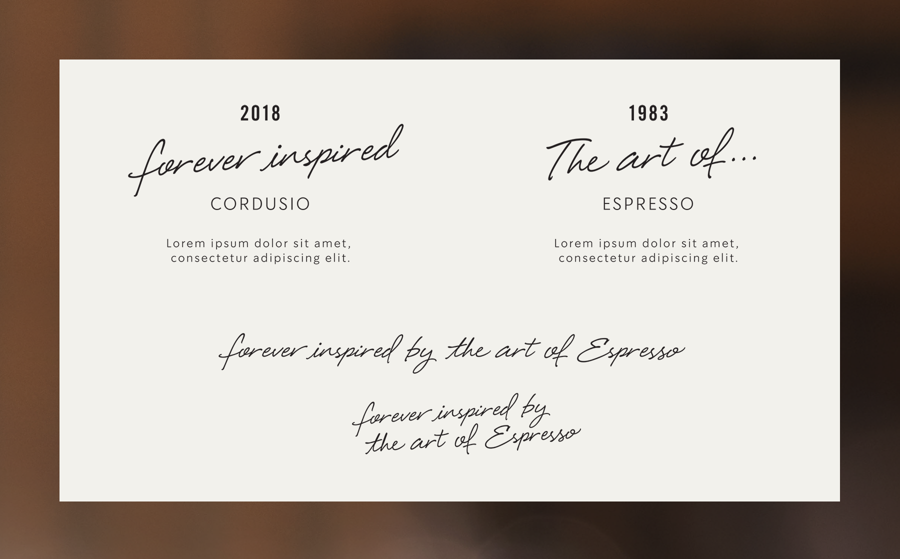
final lockup + typography exploration


